Showing posts with label color therapy. Show all posts

Wednesday, February 4, 2015

Wedding Wednesdays: Style Inspiration

Excuse my missed post last week. It seems the last week of my 20s required a couple days spent in bed with the flu. Now that I'm all better, a week into my 30s and a few pounds lighter, I'm back to tackle this week's Wedding Wednesdays. Today's topic is style inspiration. People would often ask me what the theme of the wedding was. I had to laugh because it sounded like I was planning a prom, where there would be columns made of poster-board sized playing cards and oversized cardboard dice in every corner.


At first, I called it a Winter Wonderland. But the only Wintery decor was the bag of pine cones I had in mind for the centerpieces. When I opened my June issue of Martha Stewart and saw the above page of nail polishes, I said, "this is it, this is the color palette!" You can imagine the looks I got from basing our colors on nail polishes in a magazine. However, Mike was on board (if we replaced a shade with grey and added a 'greenish'), so neutrals were a go.


From then on out, I started pinning photos on Pinterest like a mad woman. I wanted mix-matched centerpieces. I wanted wood slabs.  I wanted candles, jars, bottles and vases. Short flowers, tall flowers - all felt flowers, with perhaps pink carnations and air plants. I wanted milk glass and vintage findings. I loved the dramatic garlands and swags with the overstated blooms. I have to admit, I keep saying "I", but in reality every image had to pass the groom-to-be (GTB) test ... and there were several ideas that were nixed!


Since the reception hall needed a little help, we wanted to really Wow guests when they walked in with a unique setup. I couldn't let go of the above image, until we realized we just had too many guests attending. We also liked the idea of doing a more simple alter backdrop, and let the flowers - and us - shine.


I started to get really overwhelmed with all the potential ideas. Are there too many directions? Is it too whimsical for a house full of antiques? Where are we going to get all these decorations and how are we going to make it look like these amazing photos. I quickly learned that Pinterest was my friend and worst enemy throughout this planning process. So many of these images are lifted straight from magazine shoots and probably not a reality, for even the most seasoned wedding planner. After gathering all of these images, I had to take a step back and figure out what was completely necessary and actually doable ... which I was still doing three weeks before the wedding!

Friday, October 11, 2013

Color Therapy

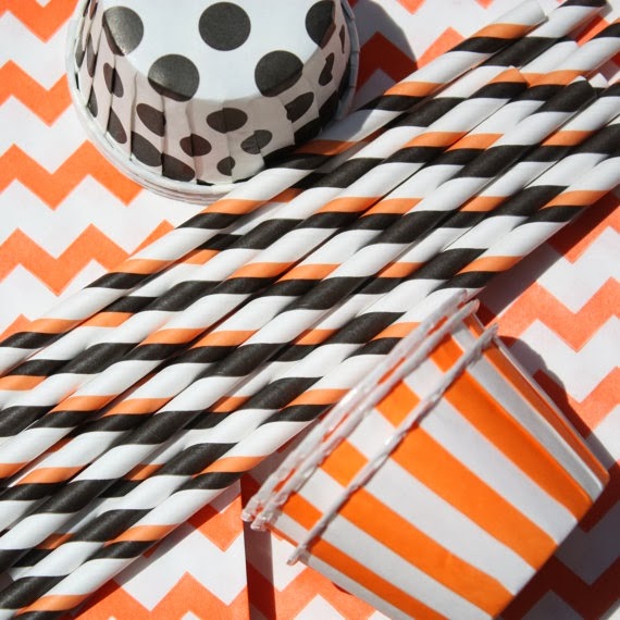
You had to have known this month was going to be Halloween themed! This will be the first year in many we won't be having our annual Halloween party, so I figured I'd live out my holiday decorating and planning through this post. You're just lucky I didn't find 30 photos of adorable black cats. Although, I suppose there is still time! Enjoy!

via


via

via

via

via

via 

via


via
   
via

via
   
via

via

Friday, August 30, 2013

Color Therapy

via indulgey

How did I make it almost entirely through the month without a color therapy!? Shame on me. Instead of just one color, I decided to go with a pattern for August. Ikat! For those of you unfamiliar, ikat is a dyeing technique, similar to tie-dye, that comes from the Malay word 'to tie.' I first saw the pattern when I was Thailand and have always been drawn to it since. The process is actually very extensive, but so totally worth it. So, on with it!
via myskyisthelimit

via lottiedababy


via tumblr


via anthropologie

via ballarddesigns

via pinterest


via belovelynow

via denise mitchell interiors


via aura home


via garoopatternandcolor

via allsaints

Tuesday, July 9, 2013

Color Therapy: Emerald Green

How about a little Emerald Green for this month's Color Therapy? Elizabeth asked for it, and she always gets what she wants :)
here

here


here


here


here


here

here

here

here

here

here


here


here

Tuesday, June 18, 2013

Color Therapy

This month's color therapy is more about the color and style of picture frames, rather than just one particular color. I've done Round 1 of photo editing all my travel photos from the years and I'm at 44. Somehow I need to get that down to a solid 15. Or less if I introduce mirrors and decor in the mix. These are the walls I'm totally digging so far.

source
Nice and calm. The black and white is a little too plain for me, but it looks nice with all black and white photos.


source
I hate when pictures touch, but this looks amazing. Although, everything looks amazing on a brick wall. Not sure I'd do all mirrors, but throwing in one or two is definitely happening.


source
Nice photo wall for the craft room where pictures could constantly change - or even the kitchen with different recipes.


source
Great looking stairwell, which we have...


source
Like the idea of using art in the corner. That way we wouldn't have to clog it up with more furniture :)


source
Mike would probably hate this. And I have to admit, it's a little eclectic for even my tastes, but it does look adorable here.


source

This is one Mike would absolutely love. It's a fantastic way to display all those panoramic photos he's always picking out!


source
The mix of wood, black, warehouse, and country is great in this.
Can you just move it to Norfolk for me?